From The Jury Room: ADC's Brand/Communication Design
By Alixandra Rutnik on Mar 23, 2023
The ADC102 Brand/Communication Design jury gets candid about the work
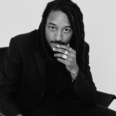
“After my colleague saw San Franscico Symphony he said it ruined his day.” Tosh Hall, Global CCO at Jones Knowles Ritchie said to Ben Crick, Designer at Apple. They laughed and Tosh continued with “when it comes down to it creatives are really just trying to ruin each other’s day with the work they’ve made. If you succeed at ruining someone’s day, congrats, you made something awesome.”
These are the kinds of conversations that take place when you get a bunch of top-notch designers together in one room. In this particular case, the room is The One Club for Creativity Gallery in New York City, and the designers are judges of the Brand/Communication Design discipline for the ADC 102nd Annual Awards. Esteemed designers from all over the globe have traveled to discuss and determine which work will be winning Gold, Silver, Bronze, or Merit awards this year. By the way, that San Francisco Symphony project that ruined someone's day? It won a Gold Cube in the ADC 100th Annual Awards two years ago.
In between scoring the work and debating its worth, we talked to a bunch of our Brand/Communication Design jury members to get some insight into what they’ve noticed during judging.
Tosh Hall – Jury Chair
Global CCO at Jones Knowles Ritchie
People are seeking inspiration from the internet. They're following trends or following other agencies or studios or something that happened last year or the year before, instead of doing what's right for the brand and solving problems. Have you ever seen a soccer match with five year olds? It's boring. It’s a bunch of people following each other around. People are thinking, “we're chasing this color, we're doing these rounded edges. Ooh, let's make it look like that case study we saw last year from that agency. They're cool. Let's copy that.” So it's derivative. It's sort of an unreality, which is a bit disappointing. The best work is effective and solves client challenges. It's also really nice to be recognized by your peers because this particular jury is full of some of the best designers on the planet. So to have your work recognized by them as breakthrough is substantial.
"They're following trends or following other agencies or studios or something that happened last year or the year before, instead of doing what's right for the brand and solving problems."
Lubna Abu-Osba
Director of Brand Management & Visual Design at Ricoh N. America
The idea of purpose driven messaging– people taking into account not just the social aspects of their messaging, but also the environmental and sustainability direction of producing what they're doing, which I thought was a really great thing that we've never really seen before. In the past there's always been PSAs, but this is more intrinsic to commercial businesses versus nonprofits and how they talk about themselves. 30 years ago everyone wanted to do Partnership for Drug-Free America ads because that was a slam dunk.
But now I'm seeing campaigns like Heinz who set out to repurpose upcycled old clothing and put the mark of ketchup on it. I thought that was really ingenious because there was a huge sustainability aspect to it. This whole idea of what's old? And how do you make it new? How do you repurpose things into a new context? And Heinz is not a sustainability brand. It's a condiment.
I saw a piece earlier today that was encased in plastic for no reason, and I gave it a two, because it was completely useless. There's nothing intrinsic to the idea. It's completely decorative and you're creating landfill waste. When I see campaigns where they show actions that actually became concrete I give them tens.
And what I see becoming a trend more and more is this idea of “phygital” (the fusion of physical and digital). You have to merge the two. Judges still want to feel things. I was disappointed I didn’t see more augmented reality and immersive experiences in this discipline, like hologram technology.
"The idea of purpose driven messaging– people taking into account not just the social aspects of their messaging, but also the environmental and sustainability direction of producing what they're doing."
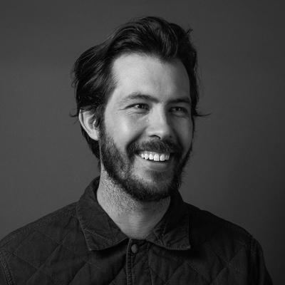
Ben Crick
Design Team at Apple
There are way too many mock ups in design now. I think everyone's mocking everything up on billboards and weed based tote bags– it's an epidemic. We live in a world of unreality now, and it's sort of sad. Sorry, I'm a little cynical about this.
Social media has changed the success metrics. Now everyone thinks success is about getting a bunch of posts on social media and getting back slaps from a bunch of people on the internet than it is about actually solving the problem they've been presented with.
There's a massive wave of bright colors all together. That's been going on for a while, but it's still kicking. There's this trendy design language which is basically putting as many typefaces as you can together in one thing. One of them will be script italic and one will be a high contrast serif design and you know it when you see it– everything has little oval around it. Yeah, there's a bunch of it and it falls into a classification in my head that I call trendy bullshit. Which I don't dismiss, but I'll definitely knock it down a peg because it's just playing with cliché. It's decoration rather than problem solving.
You always want to live on the edge in a way that you're not. You don't want to feel dated. It's important to be timely and understand the context within which you live your life. But it's also important not to give up. If all you're doing is trendy stuff then you're abdicating any actual decision making in the process. You're just grabbing a bunch of shit, you know people already like and you're putting it together. The cardinal sin as a creative is unoriginality. Creativity is about breaking new ground, so I have a fairly visceral reaction toward trend chasing because it feels like it's somehow sinful.
For something to deserve an award, it has to be extraordinary. Gold is, "wow, you've done something I've never seen before," which is really hard to do. Silver and Bronze is like, "you almost got there." Merit is still pretty good. Anything that gets any kind of award should be extraordinary– extraordinary beyond what you would normally see. So I find when I'm looking at these entries, I think, “If I walked down the street and saw that poster on the wall, would I stop and go, woah, that's cool?”
"The cardinal sin as a creative is unoriginality. Creativity is about breaking new ground, so I have a fairly visceral reaction toward trend chasing because it feels like it's somehow sinful."
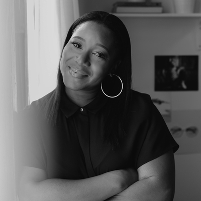
Rachael Hardy
Head of Creative at 19th & Park
We saw one project that was a bottle top to create pepper spray, which is solving a social problem and giving it a solution. When brands aren't taking a functional step in some way, it makes you think, “well, what are they doing?” We saw a lot of purpose driven projects that were not nonprofits. Campaigns like The Tampon Book, where you begin to change laws and legislation.
"When brands aren't taking a functional step in some way, it makes you think, “well, what are they doing?”"
Kendall Henderson
Design Director – Graphic Design at Please Respect Our Neighbors
I’ve enjoyed some of the attempts to go back to traditional invites and printed materials. Gradients are still happening somehow. They've been refined, I suppose, by adding texture, but it's pretty much something that came from the web 2.0 time. But, yeah, I'm surprised they’re still being used as a focal point instead of being part of the systems.
"I’ve enjoyed some of the attempts to go back to traditional invites and printed materials."

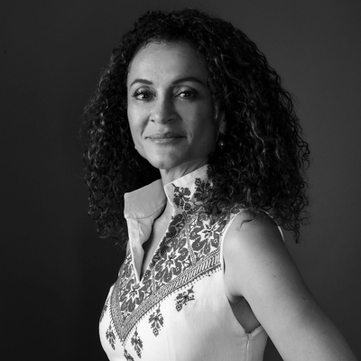
Beatriz Lozano
Design Director
Because I am so interested in typography, I would say I’m seeing a lot more custom drawn typefaces or metaphorical lettering. We're seeing characters created out of animals. We saw characters made out of women, and characters made out of flowers. It's just a reinterpretation of typography, taking on the shapes and the forms of their environments.
I've also been noticing a trend I would maybe call it interaction– creating identities where people can interact with the designs through generative coding. So maybe in P5, people can change different sliding scales and that would impact the design as well as people being able to create and transform the design. And in some pieces, there were photos of community creating letter forms as well. So it's a way of personalizing branding and making it more interactive.
"I've also been noticing a trend I would maybe call it interaction– creating identities where people can interact with the designs through generative coding."
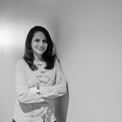
Lulu Raghavan
Managing Director at Landor & Fitch India
It has been especially interesting to see the rise of Asia. There’s a lot more work coming from Asia compared to before, and people are actually appreciating pieces from China and Japan. I don’t know if it is a trend, but it’s nice to see that work is becoming much more global.
"It has been especially interesting to see the rise of Asia."
Have you been following along during judging? Check out our Instagram & TikTok for daily updates from ADC in NYC and One Show in Puerto Rico!
Related