ADC Hall of Fame
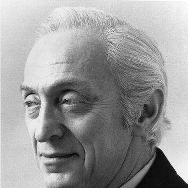
Aaron Burns
May 25, 1922 - Jul 16, 1991
Inducted: 1983
"His dreaming about things has always been the main characteristic of the man," says Klaus Schmidt of Aaron Burns. Schmidt's insight comes from a ten-year working relationship on programs for the International Center for the Typographic Arts (ICTA), which Burns founded. Others have compared him to a prospector searching for properties never before envisioned.
Whateverdesigner, educator, philosopherBurns may be considered a kind of Buckminster Fuller of typography. Rather than numbers or the dimensions of space, for him letterforms of true craftsmanship properly employed bring order to a frequently chaotic world. He has said that he could not exist in a profession not educated to an appreciation of quality. To further this end he sought to understand the language and varied expressions of type forms as they existed and then go on to help to establish new methodologies for new creations. Large concepts these, but Aaron Burns always thinks on a large scale. ICTA represented only one of several undertakings in which he played guide to designers much in need of typographical exploration or to artists seeking a fresh route. Klaus Schmidt continues: "With Aaron, each new idea propels him forward to explore yet something else new, always with this great positiveness. Even when his ideas are not successful, which is rare, they have shaped and improved typography."
Fortunately, Aaron Burns was the right man in the right place at the right time. The first graphic designer to have come to the field of type through the shop end, he saw, before most of the people in graphics, the upcoming technological revolution. With the engineers and technicians spearheading the way, he foresaw the remarkable innovations and their effects that lay ahead. By writing books and magazine pieces such as those forPrintin "Typography Today" (1964), by organizing conferences and seminars which engaged the entire world-graphics community, by consulting and preaching, he worked to show art directors what had happened to typography and what was about to happen. In another capacity, he created many award winning graphics during a distinguished graphic design career. This Hall of Fame Award, however, is not for those but rather for the qualities exhibited by an insightful mind and its influence on the work of others. Thus, his citation here broadens the scope of the Hall of Fame itself.
Still, Aaron Burns is not all visionary, for underlying all is a common-sense directness and thoroughness of thought and action. With an early aptitude for drawing, he thought first of cartooning while at New Jerseys Passaic High School. This led him quite naturally to the Newark Evening School of Fine and Industrial Arts and then, quite normally at the time, into the United States Army. When the Japanese failed to execute their feared designs on the Panama Canal, infantryman Burns found himself in the rain forest with little to do and even less to occupy his mind. Answering a magazine advertisement, he shortly found himself enrolled in a correspondence course for advertising and design given, somewhat incongruously, by Brigham Young University in Utah.
At war's end, the tropics behind him, civilian Burns now found no demand for his skills in the marketplace. Facing the reality squarely, he offered his services to the Lancaster Advertising agency for no salary, simply in exchange for an opportunity to learn the ropes. Simultaneously, he signed up for a course in paste-ups offered to returning veterans by the Advertising Club. Shortly, invaluable advice was offered by Suren Ermoyan who had used the device himself: a frugal postcard self-promotion campaign. Burns enlisted the aid of a copywriter at the agency, researched the names of 120 art directors at the New York Public Library, and invested $5 in typesetting and printing. Lo and behold, the "inexperienced but willing, salary-no-object" young man had seven job offers from which to choose.
Almost immediately thereafter came what Burns calls the biggest break of his life, an opening to apprentice with graphic designer Alexander Ross. Coincidentally, Ross's studio was in a building occupied by Davis & Delaney, one of the city's foremost printers. There Burns would take the layouts from the studio to the composing room and watch while the type that he had specified was set. He observed the photo engraving, the printing, the color mix and he saw what could happen, for good or bad, when 12 pages of copy were transformed into typography. Equally important, he learned "what to accept and what to reject."
His imagination was caught and unconsciously, perhaps, the entire course of his career and his life were altered. Unwittingly, he had become a typophile. He studied old type books, especially those of the American Type Founders which set the standard of the day, studying and reading ever more widely in every spare moment.
It must be recalled that in America during and immediately following World War II there were few consumer products to advertise; posters, as the primary ad medium of the time, carried few words. By the end of the 40's, however, automobiles, refrigerators and even television sets were pouring off the assembly lines. After years of enforced silence, manufacturers wanted to say everything they could about their products. As a result, myriad words covered every page. With the exception of leading designers, according to Burns, "most did not know how to handle all the words."
In his own mind, Burns determined that good typography went hand in hand with the aptness of the selling solution. In his bookTypography(Reinhold Publishing, 1960) he later presented the thesis that "typography is an attitude. In the interim, he looked to the Old World where European traditions had helped to shape American thought on the subject and concluded that all modern typography was in need of analysis.
Following his time with Ross, he worked briefly as an assistant toHerb Lubalin, who later became his partner in the International Typeface Corporation and "U&lc"; he worked as an art director at Monogram Art Studios, then as director of design and typography at Empire State Craftsmen, and later held a similar post with The Composing Room. Here he worked with some of the finest typographic designers and artists in the country and the type shop, in effect, became for him a laboratory for typographic experimentation.
During this period, Burns developed into a superb typographic interpreter, acting as a kind of psychiatric middleman, whose "noodling" would have countless future applications. At the time, an enormous gulf existed between designer and typeshop. Each expected the other to know not only the basics of the other's skill but the nuances of the craft as well. It was here, then, that Aaron Burns set about to bridge the gap.
He taught a course in advanced and experimental typographic design at Pratt Institute. As always, his extra-curricular activities ran parallel with his professional life. His early association with the Type Directors Club called upon him to design the announcements heralding some lectures on the nuts-and-bolts of type. In the past such announcements had been set in nuts-and-bolts type. Burns jolted the membership by creating announcements of style and grace that captured the attention of typographers and art directors alike. Soon after, he changed the entire complexion of modern type specimen booklets as well. He changed them from simple, conformist black-and-white affairs to lively specimens done in every color on the artist's palette. In fact, it was his aim, he says, "to get designers to think of type as another color on the whole artistic palette."
Today, it is difficult to realize that scarcely three decades ago there was little interest in the subject, few articles written on typography, and even fewer books printed. Landmark gatherings, lectures and exhibitions under Burns's direction changed all this. As TDC education chairman, he created the lecture series, "Inspired Typography, 1926 Through 1956," bringing to the attention of American designers the work done from De Stijl and Bauhaus, and also tracing the progress of design and type in Europe during that enormously creative period. Shortly thereafter, he put together "The Art and Science of Typography" exhibition in Silvermine, Connecticut, which showed the greatest design work being done worldwide by contemporaries and brought the artists together to discuss their creations.
"What made good type?" "What made good typography?" "Did this call for new type faces?" These were some of the basic questions being asked as curiosity and excitement continued to grow within the community. After co-founding the International Center for the Typographic Arts, with more than 1,000 members in 33 countries, he chaired the symposium "Typography USA in 1960." This led to an invitation to Europe where he traveled widely, lecturing to schools and professional groups. Earlier correspondence with the greatest designers abroad developed into friendships, which led to joint speculations on the shape of typography of the future, as foundries in America and Europe were casting less metal and as the industry was moving rapidly toward the new technologies of photographic and electronic typography. In these pursuits he met withWillem Sandbergin the Netherlands, Herbert Spencer in England, Hermann Zapf of Germany and many others of international renown.
In 1964, ICTA sponsored "Typomondus 20," an exhibition of the most significant typography of the century, with over 12,000 works on view. This became a traveling exhibit and ultimately a book. The three "Vision" conferences in '65, '67 and '69 had as their theme the premise that The future is now." These reports were printed and became invaluable documents for teachers and professionals alike.
A revolution was taking place, he was convinced, that few were fully aware of. In the early years of this period he assembled leading graphic designers in his office for hours, one night a week, to explain the new directions to them. Burns's essential point was that while phototype freed and helped the designer, new computer-aided type opened a universe of choiceslimitless access to type design solutions. I told them, Burns reports, "that young people would be asking them questions and that they should have the answers."
During the 1960's, in the workaday world Burns was president and creative director of Graphic Arts Typographers and president of Aaron Burns & Company, a division of Rapid Typograpbers. This was followed by his most important years as creative director of TypoGraphics Communications (TGC). During this period also, as a consultant to the Visual Graphics Corporation, he conceived and supervised national and international typeface design competitions, which became the catalyst for designers to begin designing exciting faces again. Then in 1970 came Lubalin, Burns & Company, and the International Typeface Corporation of which he is president.
ITC was formed to meet a pressing need. With the advent of phototypesetting, it had become too expensive and too much effort for a competitive foundry to obtain a popular face requested by a customer. Foundries were forced to re-draw and to sell it under a false name. As a result, designers, distraught with the ethics and facing diminished incomes, were dropping out of the market.
With partners Herb Lubalin, creative director, and Photo-Lettering's Ed Rondthaler, producer of their types, ITC produced new faces and marketed them to subscribers, paying a royalty to the designer. An ITC register mark deterred the few dishonest companies from future piracy.
Today, Aaron Burns has more time to devote to what he loves most: to disseminate information and to champion the cause of excellence. ITC presently houses an exhibition center for the display of competition exhibits and shows. Its publication, "U&lc," the international journal of typographics, offers graphics, typography and serious writing on these subjects with a mix of humor and offbeat trivia contributed by designers the world over. In this journal, typography is shown to be a serious business, but it also illustrates that it can be an art and a genuine pleasure.
Aaron Burns maintains that few of his accomplishments were ever foresightedly planned, that more often than not these developments were "accidental." Still, grand design or no, when returning young veteran Aaron Burns mailed out his postcard advertising his untested services and skills, there was a vast industry, unknowingly, awaiting his contributions. During his years in this field, typography has passed virtually from famine to feast. And it has been a smoother road to travel for those who have been able to benefit from the precious jewels that Aaron Burns, visionary or prospector, finds every time he starts digging.
Please note: Content of biography is presented here as it was published in 1983.