ADC Hall of Fame
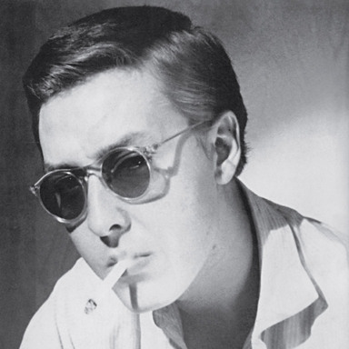
Robert Brownjohn
Aug 8, 1925 - Aug 1, 1970
Inducted: 1995
Throughout his career, Robert Brownjohn maintained a fast-paced lifestyle, which was integral to his art, his theory of graphic design, and his method of working. He ate, drank, and spoke extravagantly, demanded the highest wages, and socialized with rock stars and glamorous fashion designers, models, and actors.
All who knew Brownjohn speak of there having been an aura of brilliance around him.Architectural Forumnoted that he may have been the most talented student ever to have graduated from Chicagos Institute of Design. He personified the ideal his teacherLszl Moholy-Nagyexpressed inVision in Motion, that art and life can be integrated: The true artist is the grindstone of the sense; he sharpens his eye, mind and feeling; he interprets ideas and concepts through his own media.
In his short but intense working life, Brownjohn helped to redefine graphic design, to move it from a formal to a conceptual art. His projects exemplify every aspect of his relationship to design, including his emphasis on content over form and his preferences with ordinary and personal images. His spirit of invention and designs for living in the machine age were balanced with references to the aesthetic models that Moholy-Nagy admired.
Bj, as he signed his name and was familiarly called, arrived at the Institute of Design in 1944. He worked with Moholy-Nagy on advertising and exhibitions, and was appointed as a special student in architecture by Serge Chermayeff. After leaving the Institute in 1947, he remained in Chicago and free-lanced for several advertising and architectural offices until Chermayeff invited him to return in 1949 to teach full time. A professor without a degree at the age of 24, Bj stayed for barely a year before leaving for New York.
To support himself in New York, Brownjohn free-lanced in graphic design. He worked for brief periods with The Herman Miller Furniture Company, George Nelson, and Ed Bartolucci at Bob Cato Associates. His clients included Columbia Records, the American Crafts Museum, and Pepsi Cola. In 1957, Brownjohn joined forces withIvan ChermayeffandTom Geismar. As ringleader of Brownjohn Chermayeff & Geismar, he always insisted on new ideas, fresh imagery, and the best conceptual solution to the problem at hand. His goal was not to make things pretty but to arrive at a design that would solve a problem both conceptually and formally.
Bj looked to the physical world around him for inspiration and fresh ideas.Tony Palladinodescribes a trip he took to Coney Island with Brownjohn, Chermayeff, Geismar,Bob Gill, andGeorge Tscherny: We were looking for graphic turn-ons that later we could apply to jobsthe fresher the essence, the better the job was. Brownjohn believed that if an idea couldnt be described over the telephone, it wasnt simple, clear, and direct enough to work.
Brownjohn Chermayeff & Geismar did well in its first year. The partners celebrated the first anniversary with their families. Sara Chermayeff, Ivans wife at the time, recalls that Bj made the dessert, which was a big bowl of Jell-O full of nickels and dimes. He was the original Pop artist for sure.
Two years later, the partnership ended amicably. With his wife, Donna, and daughter, Eliza, Brownjohn moved to England, where he worked for J. Walter Thompson as creative director. His style was a new experience for the JWT staff. He was interested in found objects and typographic junk collected in the street, kept odd hours, was often absent, and spoke his mind. The fact that he was paid so much more than everyone else earned him a good deal of resentment at first, but soon he was accepted, respected, and loved.
Wooed away by McCann-Erickson, Brownjohns first important commission there was for Taylor-Woodss Lifelon stockings. To convince exhausted women with bad legs to buy expensive hosiery, Bj used a black-and-white photograph of glamorous legs, cropped to a sensuous abstractiona simple, sculptural form reminiscent of Constantin Brancusis sculptures. The advertisement read, A girl who would spend 12/11 on a pair of stockings ought to have her legs examined, and won every award possible in England and abroad. The words and the design came together, McCann-Ericksons David Burnstein said, referring to the fact that Brownjohn often wrote his own copy. He was a great synthesizer, thats better than simplifierhe loved accidents, making accidents, he was a walking accident.
At the same time Brownjohn was working at McCann-Erickson, he was commissioned on a freelance basis to design titles for the first James Bond film,From Russia with Love.Alan Fletcherdescribes Brownjohns original presentation of the concept to the films producers: Bj set up the projector, everyone filed in and sat down. Bj turned off the lights, took off his jacket and shirt, and wiggled in front of the titles from the lit projector. Itll be just like this, only well use a pretty girl.
Largely on the strength of these titles, Brownjohn joined a film-production company, Cammell Hudson (which later became Cammell Hudson & Brownjohn), in 1964. Carrying out, in his own style, the teachings and aspirations of Moholy-Nagy, he used architecture as comparison and model. Architecture is the greatest catalyst in design, he said. It provides a structural sense and discipline to your composition. I like working with film because it is a very architectonic medium. Making a movie is building in space. Brownjohn took the simplest technical capabilities of the camera and used them to enlarge the conceptual limits of filmmaking. In David Cammells words, He was so experimental and restless that he gave the impression of being an amateur.
Brownjohn continued to design for print as well as film. When Michael Cooper, the well-known photographer of the Beatles, insisted that Bj design his business stationery, the result was both funny and indicative of Bjs own reputation at the time, featuring Bjs name in gigantic type, as large as Coopers own name.
Brownjohns last completed project was for Dick Davidson, a longtime friend from New York, who commissioned designs for a series of peace posters from well-known artists in New York and abroad. Brownjohns design utilized his own handwriting and is signed, as if to his friends, Love, Bj. The death card, the question, the lack of color, and the emptiness of the poster imply the nature of the peace Brownjohn foresaw for the world around him, and for himself.
Please note: Content of biography is presented here as it was published in 1995.